News
Marketing
Red Sun Farms goes bolder with revamped butterfly logo
February 2, 2021 By Greenhouse Canada
Red Sun Farms has changed up their branding.
The vertically integrated greenhouse producer has a new logo that incorporates the iconic butterfly while maintaining bright, bold colours that honour the history of the brand.
The modern refresh “reflects growth and innovation that re-enforces a positive and progressive brand identity,” states the press release.
“As the brand continues to grow in both retail and trade events, it was clear that we also needed to evolve our logo to better represents who we are today, while encompassing the possibilities of where we will grow our business tomorrow.” states Carlos Visconti, CEO of Red Sun Farms Canada & the USA, “We continue to invest in our future and our brand to better support our customers.”
This move comes shortly after the company’s graphic refresh launch and was the result of market research, retailer feedback and consumer inquiries designed to improve customer connection to the brand.

Hercules
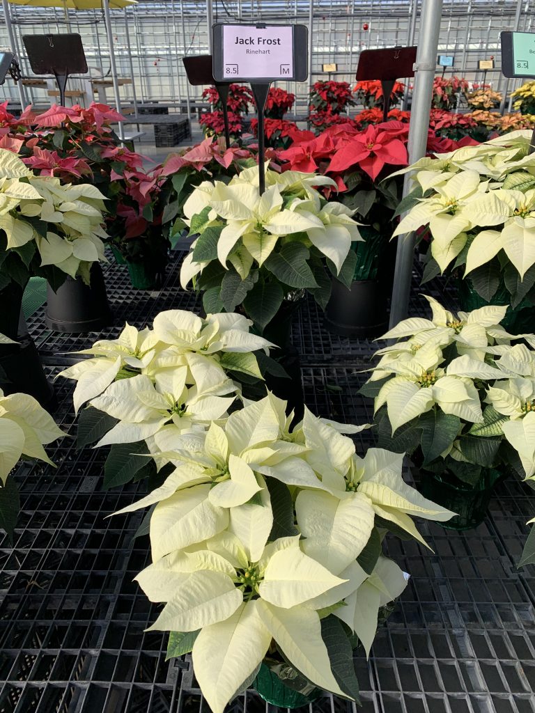
Jack Frost

Legendary

Legacy

Pepita

Pure White

Southern Charm
Source: Red Sun Farms
Print this page