Sept. 7, 2012, Carlstadt, NJ — Gardens won’t be the only things going green this spring, according to colour authority Pantone.
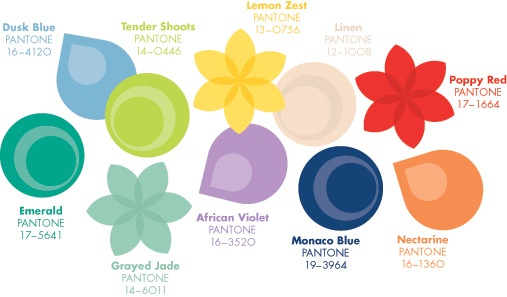
Pantone’s Spring Fashion Colour report revealed the colours top
designers will be using in their upcoming collections – including
several shades of green, as well as a host of other colours sure to
welcome spring in style.
“The expression ‘balancing act’ is
something we all relate to as we strive to find harmony in the frantic
pace of our everyday lives,” said Leatrice Eiseman, executive director
of the Pantone Colour Institute. “The same can be said for fashion as we
look for balance between light and bright, classic and new. This
season’s colour palette emphasizes this need for balance, while at the
same time allowing for individuality, self-expression and excitement.”
Spring’s top colours include:
- Grayed Jade, a subtle, hushed green with gray undertones
- Emerald, a lively, radiant green that inspires insight and clarity while enhancing a sense of well-being
- Poppy Red, a seductive, sensual and celebratory shade
- Dusk Blue, a calming sense of serenity akin to its green counterpart, Grayed Jade
- Linen, light and airy, providing a nude-like basic
- Monaco Blue, a classic shade that offers stability and depth to the entire palette
Each
season, Pantone surveys the designers of New York Fashion Week and
beyond to collect feedback on prominent collection colours, colour
inspiration and colour philosophy. This information is used to create
the Pantone Fashion Colour Report, which serves as a reference tool
throughout the year for the global design community, retailers and
fashion enthusiasts.

Print this page