Features
Business
Retail
Is Your Store Smartphone Ready? Feb 2015
Twenty-five per cent of us use our smartphones daily to specifically search for local businesses or services, and 58 per cent use our smartphones while shopping.
January 20, 2015 By Kristin L. Getter
 Smartphones offer new opportunities in marketing to consumers.
 February 2015 – According to the Pew Research Centre, 56 per cent of U.S. adults owned a smartphone in 2013, which is a significant increase from 35 per cent smartphone ownership in 2011.
The key feature of a smartphone compared to other mobile phones is its ability to connect to the Internet. Seventy-nine per cent of smartphone owners use the Internet daily from their smartphones. Twenty-five per cent use their smartphones daily to specifically search for local businesses or services and 58 per cent use their smartphone while shopping.
The smartphone has become so important in everyday life that 19 per cent would rather give up their TV than their smartphone. After all, many are using their smartphones while watching TV (52 per cent, actually), and they can even watch TV on their smartphone.
Smartphone owners have high expectations of the websites they visit on their smartphone. A study commissioned by Google, called “Our Mobile Planet” (www.thinkwithgoogle.com/mobileplanet), found that 70 per cent of smartphone owners expect the websites they visit on their smartphones to be as easy to navigate and access as they are when they visit them on their desktop PC or tablet.
FREE AND SIMPLE WAYS TO CONNECT WITH SMARTPHONE USERS
Because there are many ways for your retail greenhouse business to connect with smartphone users and the technology is constantly changing, this article will concentrate on the most popular ways to connect.
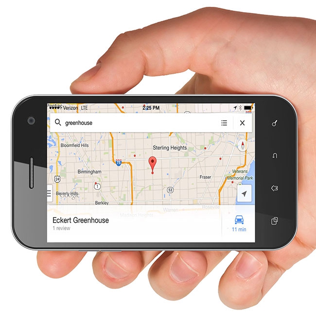
The first way to connect, which is free and requires little work, is Google Places for Business at www.google.com/business/placesforbusiness.
Entering your business information in Google Places ensures that your business can be found on Google maps and Google for desktop or mobile searches. It has many free features that allow listing of your company name, address, phone number, website, hours of operation, photos and additional details like a description of your company or where to park.
The second easy thing to do is to ask your customers to review your store on a social rating site.
There are many such sites and one popular one is Yelp (www.yelp.com), which is a website or mobile phone application that lets customers review your establishment. They can rate your business on a scale of one to five and type in information about their experience with your business.
According to its website, Yelp had an average of 117 million monthly unique visitors in the third quarter of 2013, and it had over 47 million local reviews. It is free to set up an account with Yelp and to post photos and messages.
Facebook is another medium through which to ask for customer feedback or ask customers to “check-in” when they are visiting your store. Opening a Facebook business account is free; visit the Facebook for Business page for details on how to do so.
The next easiest thing to do is to incorporate two-dimensional (2D) codes into your marketing plan. You are probably very familiar with one-dimensional (1D) codes that are used on retail products for scanning in prices. Two-dimensional codes are similar, except they have two dimensions (both vertically and horizontally), which allow them to store a lot more information than a 1D code.
The most common type of 2D code is the QR code. Smartphones use the phone’s camera to scan in the code and the information embedded in that code is displayed back to the smartphone’s screen.
QR codes can be placed on signs, tags, pots, and more. The QR information that is returned to the smartphone’s screen could be a video or picture (perhaps a link to a YouTube video demonstrating how to use your product?), a website that gives more information on the product or shows the consumer how to use the product, a link to your Facebook page, and many other options.
If the QR code redirects the consumer to a website, it is best to link to a mobile-optimized website, one that has been optimized for small smartphone screens, so that the viewer has a positive experience. Websites that are viewed on smartphones that are not mobile-optimized have small print and content that runs off the screen, which may frustrate smartphone consumers.
There are many websites that will create a QR code for free. Simply perform a web search for “QR creator” to find such sites.
When using QR codes, make sure to test them from multiple device types (for example on an iPhone, Android and Blackberry) to make sure the code can be read accurately and redirects the phone to the content it is supposed to display.
Keep the area around the QR code free of other distractions for ease of scanning. For instance, if you have a sign in your retail area with a QR code, but then put a plant in front of the code itself, it makes it difficult for the smartphone owner to scan that code.
For printed material, the QR code should be at least one-inch by one-inch and increase by one-inch for every foot of distance from which the customer will be scanning it. In addition, if your retail area does not have good cell coverage, consider not adopting QR codes or installing an industrial signal booster that improves cell phone signals for multiple users.
OTHER METHODS REQUIRE MORE INVESTMENT TO CONNECT
More technologically savvy retailers may want to consider going above and beyond these simple and free means of connecting with smartphone consumers. The next logical step is to ensure that your business has a web presence, preferably one that has the ability to optimize the screen layout and size for small smartphone devices.
There are three different philosophies in mobile-optimized website design.
One such philosophy is called responsive web design, which uses flexible templates that adjust the screen layout for a particular device. The web server always sends the same hypertext markup language (HTML) code to all devices, but templates alter the rendering of it on the fly, even as screen size changes after loading.
Advantages to this method are that your website contains the same content regardless of the device being used, so all viewers will have a similar experience regardless of screen size. This method also allows you to have a single web address (a universal resource locator or URL) that makes it easier to share and link to your content.
A disadvantage to this method is that the web content itself won’t be fully optimized for mobile devices. In other words, all the web pages viewed from a smartphone will contain the same information as if viewed from a desktop computer. This may lead to slower performance on smartphones because all of the content is being loaded.
Another mobile-optimized website design philosophy is to dynamically serve different HTML code on the same URL. In this design, the web server detects device screen size and then builds appropriate HTML on the same URL. In this way, a custom page is built as the web server detects the device size.
Advantages to this method are that the navigation structure can be customized for the different tasks performed by mobile and desktop viewers and there is less page bloat for the smartphone users because they are only loading content specific to them, resulting in faster load time.
Disadvantages to this method are that it requires more web server resources to dynamically build the HTML, and it also requires device detection, which is sometimes unreliable.
The third mobile-optimized website design philosophy is to build separate mobile URLs from the desktop URLs. In this philosophy, each desktop URL has an equivalent mobile URL serving mobile-optimized content.
For example, a desktop-designed website with the URL of www.example.com might have a mobile URL of m.example.com. The web browser detects if the viewing device is a smartphone and redirects the viewer to the corresponding separate mobile site.
Advantages of this design are that it is easier to make separate changes to the mobile and desktop sites and allows faster load time and easier navigation for smartphone viewers because only mobile content is loaded.
Disadvantages include having to maintain multiple URLs for each page (one for the desktop URL and one for the mobile URL). Sharing a web page on social media also may become an issue because mobile users will share the mobile URL with desktop viewers who may click the link and get the mobile version. The redirection from the desktop URL to the mobile URL increases web page load times and can have implications for your site’s search engine optimization (SEO).
MOBILE WEBSITE DESIGN TIPS
In designing any website that may have frequent views from smartphones, there are some design criteria that must be considered. Make sure that pop-up screens are not enabled for mobile viewers. The pop-up would likely be unreadable due to its small size and may produce unexpected results. It also uses device memory.
When posting videos to your website, be sure they can be played back on multiple devices. Many video players require Flash or Java software, which may not be supported on smartphones, especially older models. If you choose the separate mobile URL design methodology, be sure to use similar URLs between the desktop site and mobile site so as not to cause brand confusion. For example, Domino’s Pizza uses www.dominos.com for its desktop website and mobile.dominos.com for its mobile-optimized website.
When using separate mobile URLs, faulty redirects are also common. Faulty redirects occur when a smartphone lands on a particular desktop site and is redirected to a non-corresponding site.
For instance, if a mobile viewer lands on the desktop URL of www.example.com/coupons, a mobile redirect should route to m.example.com/coupons. In some instances the redirect may take the mobile user to m.example.com, which is not the specific page the viewer wanted. Also, make sure that any links on the mobile site link to other pages on your mobile site, not to pages on the desktop site.
Website load speed is more important on mobile than on a desktop device. With that in mind, don’t use too many images on the mobile site, as they will take time to load and eat up device storage space. Also, reconsider all content so that the mobile viewer has a concise version of your website rather than an exact copy of your entire desktop site.
Another good tip is to remember the size and limitations of a finger. Although a 16 by 16 pixel icon on a screen is no problem for a computer mouse, it can be for a finger. A 44 by 30 pixel minimum is recommended for sites that will be navigated by with a fingertip.
If you have a dedicated mobile website, consider including a link to switch from the mobile version to the desktop version and vice versa. This allows a viewer to manually navigate to the proper site in case they accidentally landed on the wrong one.
Other content to consider for a mobile-optimized website includes tap to call links (an icon or link that automatically calls your business when the smartphone owner selects it), tap to email links (an icon or link that automatically starts an email to your business when the smartphone owner selects it), and social sharing links, such as links to your business Facebook or Twitter pages.
Finally, be sure to test the mobile website on multiple types of devices, such as Android, Apple and BlackBerry, to make sure that the design you had in mind is indeed rendered across devices.
Implementing any mobile-optimization for your website may require hiring a professional web developer. However, it is still useful to know about all these different design philosophies so that you can have an informed conversation with the potential developer.
In addition, there are web-based programs available (for free or for a fee) that can create or convert your existing website into a mobile-optimized one. One site that I tried was called DudaMobile, available at www.dudamobile.com, which is an AT&T, Google and Yahoo partner. Other software includes Mofuse.com, Mobisite and Conduit. To find other software, simply perform a web search for “mobile website designer” or “mobile web page converter.”
This article was adapted from a January 2014 e-Gro report written by Dr. Kristin L. Getter, a floriculture outreach specialist at Michigan State University. Reprinted with permission.
Print this page